Executive Summary 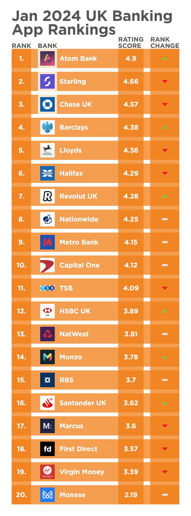
The January 2024 Touchpoint Group UK Banking App Insights Session had a particular focus on Monzo, a prominent player in the UK mobile banking landscape.
Understanding Engaged Customer Score (ECS)
To get the most from these sessions, we need to understand the Engaged Customer Score (ECS), a metric instrumental in assessing user sentiments in the mobile banking sphere. Leveraging data from platforms like the App Store and Google Play where users leave both a score AND a comment. ECS provides a holistic view of customer feedback, identifying areas of commendation and improvement. Analysis of ECS trends over the past year unveiled notable performers and areas requiring attention, laying the groundwork for deeper exploration.
Among the key players scrutinised during the session, Monzo emerged as a compelling case study in transformative improvement. Noteworthy was the bank's significant enhancement in ECS, skyrocketing from 3.3 in December to 3.8 in January. This remarkable progression underscored Monzo's commitment to addressing prevalent pain points and elevating user experience.
Pain Points Analysis: User Interface Issues
Utilising Touchpoint Groups AI-enhanced Ipiphany analytics platform, a myriad of challenges faced by Monzo users, ranging from cumbersome navigation to sluggish app responsiveness were identified. Issues relating to app usability and interface design were particularly prominent, with users expressing dissatisfaction over navigation complexities and design intricacies.
Monzo has clearly worked hard to rectify this and create a more seamless banking experience for its clientele.
Strategic Interventions:
The change in feedback and ratings clearly shows Monzo responded effectively to the identified pain points, Monzo appears to have implemented a series of strategic interventions designed to address user concerns and bolster satisfaction levels. From refining app navigation pathways to optimising interface design elements.
Positive Impact on User Experience:
The concerted efforts undertaken by Monzo yielded tangible results, as evidenced by the substantial improvement of nearly 20% in ECS scores from December to January. User feedback indicated a notable decline in complaints related to app usability and interface design, signalling a positive shift in overall user experience. By prioritising user-centric design principles and responsiveness to customer feedback, Monzo succeeded in enhancing customer satisfaction and solidifying its position as a leading player in the UK mobile banking landscape.
The transformative potential of data-driven analytics in the mobile banking sector is massive.
By leveraging platforms like Ipiphany, institutions can act swiftly to proactively address user concerns, mitigate operational challenges, and ultimately enhance customer satisfaction. For banking entities seeking to optimise their digital offerings, engagement with AI-driven analytics solutions presents a transformative opportunity to stay competitive in the evolving landscape of mobile banking.
Monzo's journey serves as a testament to the power of strategic intervention and proactive engagement in driving meaningful improvements in user experience. As the digital landscape continues to evolve, organisations must remain vigilant in their pursuit of excellence, leveraging insights to anticipate user needs and deliver unparalleled value.
Video Transcript
Hello, everybody, and welcome back to another Touchpoint Group Insight session. We are looking at January 2024 for the UK market, and I have a new amazing presenter with me this month is Yazid Kakaria, and he is our, uh, global head of AI analytics and CX Strategy. Now, Yazid, let's get straight into.
And I really want to hear from you, some of those interesting findings for the UK market in January and possibly even looking back into December. What have you got for us? Sure. Thanks, Glenn. So, we are tracking about 20 banks and financial institutions in terms of their mobile banking experience, uh, in the UK market.
And we will be using our AIpowered analytics platform epiphany to tell the story today. So, before we jump into, uh, looking at the performance of different banks, I would like to explain the concept of ECS or engage customer score. So we are analysing. The data, uh, that users leave behind on App Store and Google Play and the data where we have the review rating along with a comment.
That is what we analyse, because the users are explaining why they have given a certain rating and we call those users as engaged customers and they give us a really good direction in terms of what is it that the banks are doing well and what areas need improvements. So jumping straight into it, as you can see on my screen over here, we have five key players in the UK market over here.
And let's start off with looking at how the engaged customer score looks over a period of the last twelve to 13 months. So broadly, we can divide these five banks into two sets. So if we look at Lloyds, Starling and Halifax, their performance has been in a, uh, relatively higher range and there has been relatively less fluctuation in terms of their engaged customer score over this entire time period.
On the other hand, if we look at Virgin Money and Monzo, we can see that their engaged customer score has been in a lower range, and the fluctuation is also relatively higher compared to the top performing brands. Now, today, we are going to be focusing mainly on Monzo, because we are seeing an interesting development that's taken place over here.
So, as we can see, in the month of January 3, that's last month, the engaged customer score for Monzo has reached the highest point. Across the last twelve to 13 months, it's reached 3.8. So that's something significant that we need to look at. And let's try and understand what resulted in this shift in the engaged customer score from 3.3 in December to 3.8 in January.
Absolutely. Now, uh, that's a big jump. Can we have a look and see what they've done to make this happen? Sure. Absolutely. Glenn and. I get into that is also just make a note of September where the score was at a really low point because in my next UH visualisation I'm going to explain this as well.
So now m getting back to our question of what changed in January. I'm going to bring up something known as the pain points analysis so I'll take a moment to explain what's going on over here. So through this analysis we are trying to capture the negative feedback that users have shared with us regarding their mobile banking ah app.
So all the percentages and the different topics that you see are highlighting the negative experiences that users have had with their mobile banking Ah app. Now in the previous visualisation we did see that the score was at its lowest point in September and over here you can see uh uh an inverse relationship with the pain points as the incidence of pain points is highest in September and the score was lowest.
So we do see this relationship between the engaged customer score and. Our pain points analysis, and that is what helps our clients to understand what are the areas that need immediate attention. Now, coming back to the question of December and January. So in December, we are seeing the top pain points, which include the app being difficult to use, poor app ah interface.
Then, of course, we have technical issues as well. But then looking at the other key one, which is poor app Ah design, we can see that three of these five pain points have declined by over 50% in January. So if we look at app, uh, being difficult to use, it's dropped from 16% to 8%, interface has dropped from eleven to 4%, and design has dropped from six to 3%.
Which means that in January, we have fewer customers who are talking about these issues that they have faced. So that straightaway tells us that, yes, in January, there has been a sharp improvement in the user experience over here. Yes. Remember, there were 16% of users felt that the app was difficult to use.
Is there any chance we can get some insights in terms of why they said that? Yes, definitely, Glenn. So, so far, what we have seen is we've seen the engaged customer score and we've seen the pain points. But now let's try and dig in and get to the root of this particular topic, which is the app being difficult to use, which was the most is, uh, important topic in the month of December.
So what I'm going to do is I'm just going to click on this particular topic over here, and instantly I can see that on the right hand side, a panel opens up, and this panel is going to allow me to dig deeper into this topic. So, a few key statistics over here.
I get to know the average score for this topic, which is the app being difficult to use. It's only at 1.7 come compared to my overall average of 3.3 in December, which tells me that this particular topic is pulling down my score to a great extent. And I don't want more people talking about.
This, otherwise this gap is going to increase. Now, here we can also see some of the subtopics within this topic, which comprise of all the user comments, uh, in this particular area. Now, what we can do over here also is we can compare Monzo to other players and see how they performed in this area in December.
So in the benchmark view over here, we can see the incidence of pain points for this particular topic of app being difficult to use across, uh, the key players in the UK market. And what we find out is that Monzo is having the highest incidence of pain points for the topic app being difficult to use in the month of December, which tells us that other banks are performing much better on this front.
Of course, we have a few others, like director Nat Waste, uh, also have relatively higher, uh, incidence of pain points. But Monzo by far has the highest incidence of pain points on this topic.
Now what we can also do is we've taken a look at the key statistics over here and compared ourselves to competitors. But now I want to take a slightly deeper look and see what are the key things that customers, uh, are talking about when they say the app is difficult to use.
So we have people talking about, it's difficult to navigate people talking about move pot. Then we have other topics like new layout, old layout, et cetera. So there are quite a few things that people are talking about. Now, in order to get a really descriptive summary of what's going on, I'm going to show you one of the most recent features that we have integrated in our platform, and that's the integration with Chat GPT.
So Glenn here, what Chat GPT helps us to do is it helps us analyse all the comments within this topic, and then it gives us a descriptive summary which we can analyse and use in terms of communicating with our stakeholders. So here in five. Five points. It's explained why the app is difficult to use.
It's talking about complex and confusing user interface, difficulty in navigation, poor user experience with bots. This is something we saw even in the word cloud. Slow and unresponsive app and a number of customers have also expressed their desire to revert back to the earlier version as well. And at end of it, if someone wants to look at the actual customer comments then you're free to dive into these examples and look at all the comments pertaining to this topic.
So here we have a number of customers talking about the UX being dreadful. It's complicated, difficult to manage and not user friendly. Well that's a great summary of what happened in December. Now, uh, is it possible to dive into some golden nuggets of insights on some of the smaller topics and see how they've changed over the December and January period?
Sure, definitely Glenn. So we did see a sharp improvement in January. Memory and the next visualisation that I'm going to show you is going to help us understand what are the things which have improved and what are the things which have deteriorated further. So I'll just take a moment to explain what's going on over here.
So here we are looking at a number of topics which have been covered uh based on what the users have mentioned and we are looking at four main quadrants, topics which are positive and improving topics which are positive but deteriorating negative topics and deteriorating and uh, negative and improving topics.
So here in this quadrant we have topics which are generally negative which means that anyone who talks about these topics the impact on my overall score is likely to be negative. But the good news here is that though these topics are negative there is an improvement in these topics compared to earlier time period.
So here we are comparing December and Jan. So here we can see that move pots joint account, old layout, new layout, new use. UI. All these topics have been negative but there is an improvement. So what I may do is I'm just going to zoom in a little more over here since this is our focus area and try and understand the ones which are negative and improving.
So here we are looking at move pots. So again on the right hand side the panel would open up and I can actually go ahead and see what are the different things that customers are talking about. So seems that the recent update they have made, it has made the usage of pods which are used to uh, manage your budgets and track spending, et cetera.
It's made management of pods a little more difficult and that's what's coming through over here. And similarly people talking about joint accounts. So joint account holders have faced some difficulty based on the new UI changes which have been introduced in the app. If we just look at a few over here.
So there are certain features which. Are not applicable to new users and some changes in the UI have made it difficult for joint account users as they can't manage their account in the same way that they were earlier doing. And um guess what Glenn, these topics coming up over here are ah above and beyond the framework that we have defined.
So epiphany has the power to pick up any new topics even beyond the framework that we defined for the platform and bring out those highlights. For example, joint account was not a part of our original framework but the platform is intelligent enough to bring those insights up for our users to help us dive deeper and understand this in greater detail.
Well uh, it's interesting to see how those design and UI changes can really impact that user experience to such an extent.
Yes Glenn, in fact the mobile app reviews is a very sensitive channel for customer feedback and any changes to the user experience are likely to reflect very strongly over here and design and UI changes. Can have a profound impact on user experience. Based on our experience in analysing millions of user reviews we have seen that whenever major or uh, significant changes are made to the UI there is some resistance initially.
However, banks can track the impact of these changes very easily using epiphany and also measure the recovery rate and the recovery time. For example in the January data we still have users talking about the same issues that we saw in December but the incidence of those issues is declining which helps us track that recovery period.
Yeah so that looks great Yazid. And I know that you are a seasoned professional looking at all of this but how is it that you work with clients to ensure that they get the best out of the platform? Yeah so we work very closely with our clients in this space is Glenn and some of our clients have done pilots before the launch of a new UI and we've helped them gauge the early signs of discontent among users and then.
Take an informed decision about launching or rolling back some of the key changes that they were intending to make. And the best part about this offering is that it's a turnkey solution and we manage everything for our clients right from data extraction to reporting to platform access. And it's relatively quick and easy to plug into their existing insights ecosystem.
And this contains public data, so we don't need the banks to share anything with us. Well, that is a pretty great explanation in regards to how we can use that, and a great snapshot in regards to the performance of those banks in the UK. If you want to have a chat to us in and around your bank or your app, feel free to sing out.
Reach out to one of us and we can set up a meeting. Thanks again Yazad, and look forward to having you on again next month where we dive deep into both the UK and the US markets.